Bearing Tech – Up To Date and Dependable As Always
The Client
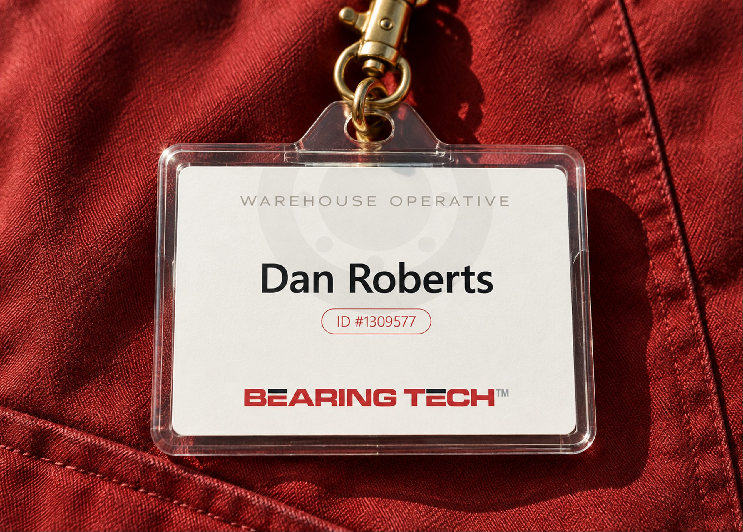
Bearing Tech is an independent stocking distributor of industrial machine parts, including bearings, motors, belts, rotors, gearboxes, and related products. Serving a national client base, the company has built nearly three decades of trust through deep technical expertise, rapid fulfilment, and a solution-oriented customer service approach that clients have come to appreciate.
Bearing Tech serves procurement managers, maintenance supervisors, and purchasing agents from factories, service companies, repair shops, and OEMs.
The Challenge
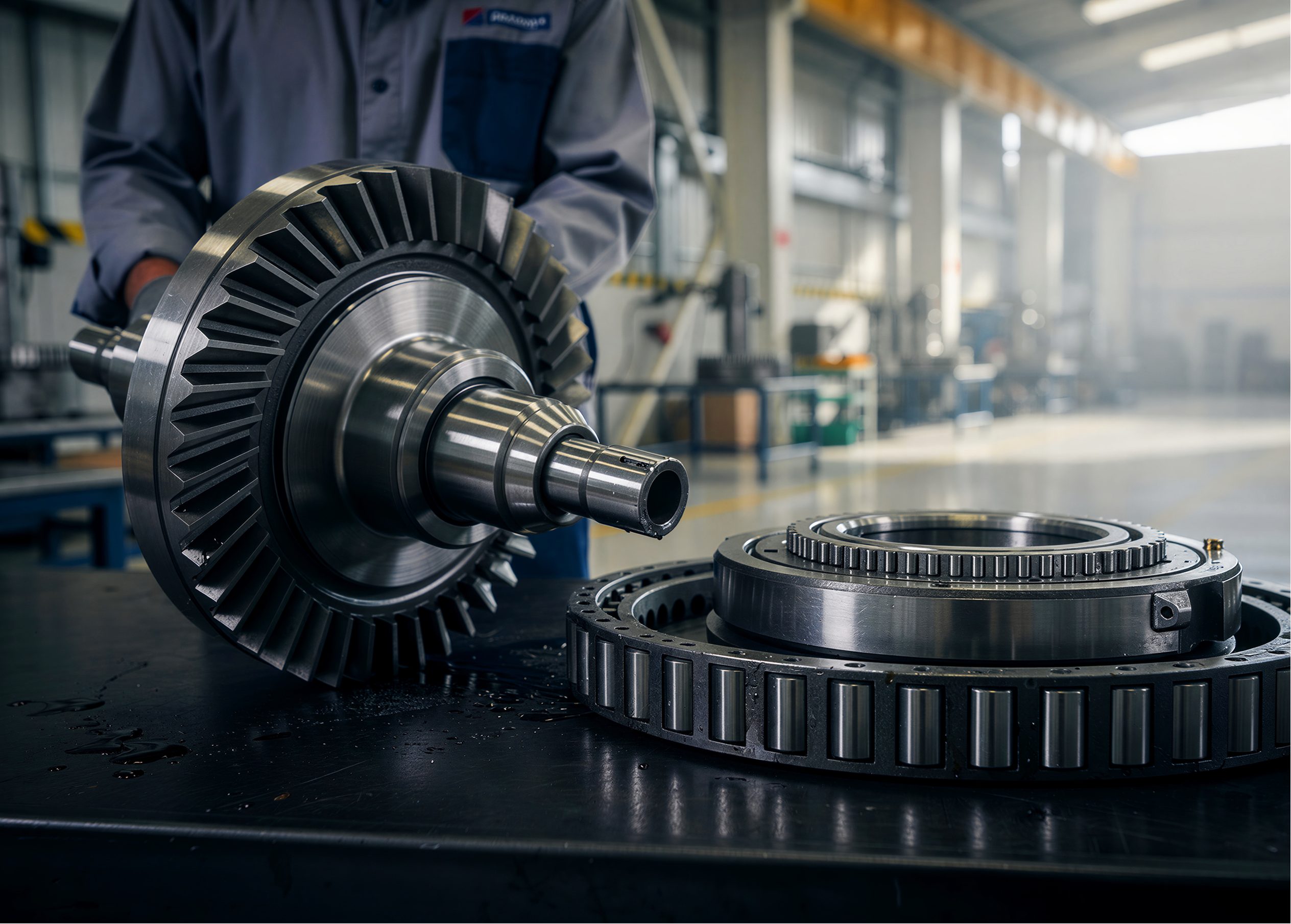
Bearing Tech came to us with an existing logo and line card. Both were outdated, and neither did justice to a company with nearly 30 years of experience. Our challenge was to come up with a fresh rebrand and line card that truly represents who they are and what they have to offer.
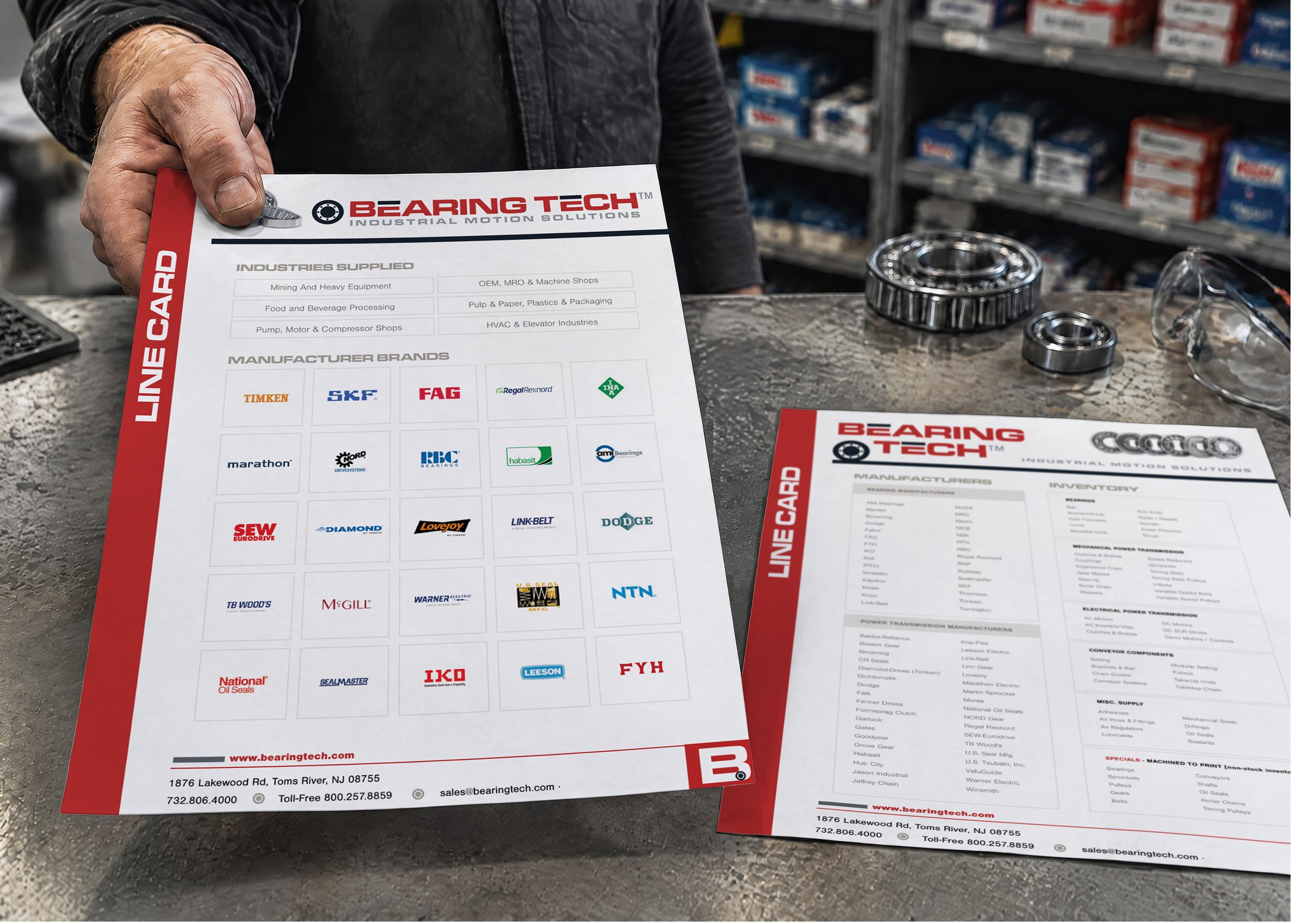
The old line card listed manufacturer names and product categories in dense blocks of text, with little visual hierarchy to help a reader quickly find what they needed. It functioned more like an internal reference sheet than a document a sales rep could confidently hand to a customer. We needed to take that same depth of information — dozens of manufacturer brands across bearings, power transmission, mechanical and electrical components, conveyor parts, and custom pieces — and organize it into something clear, credible, and visually appealing.
On top of it all was the tone challenge. The rebrand needed to feel modern and approachable, without losing the credibility of a company that's been doing this for nearly three decades.
The Solution
We outlined four brand essence pillars as the basis of the rebrand: Established, Dependable, Resourceful, and Approachable. Every design decision was tested against these four words, giving us a consistent balance of credibility and warmth.
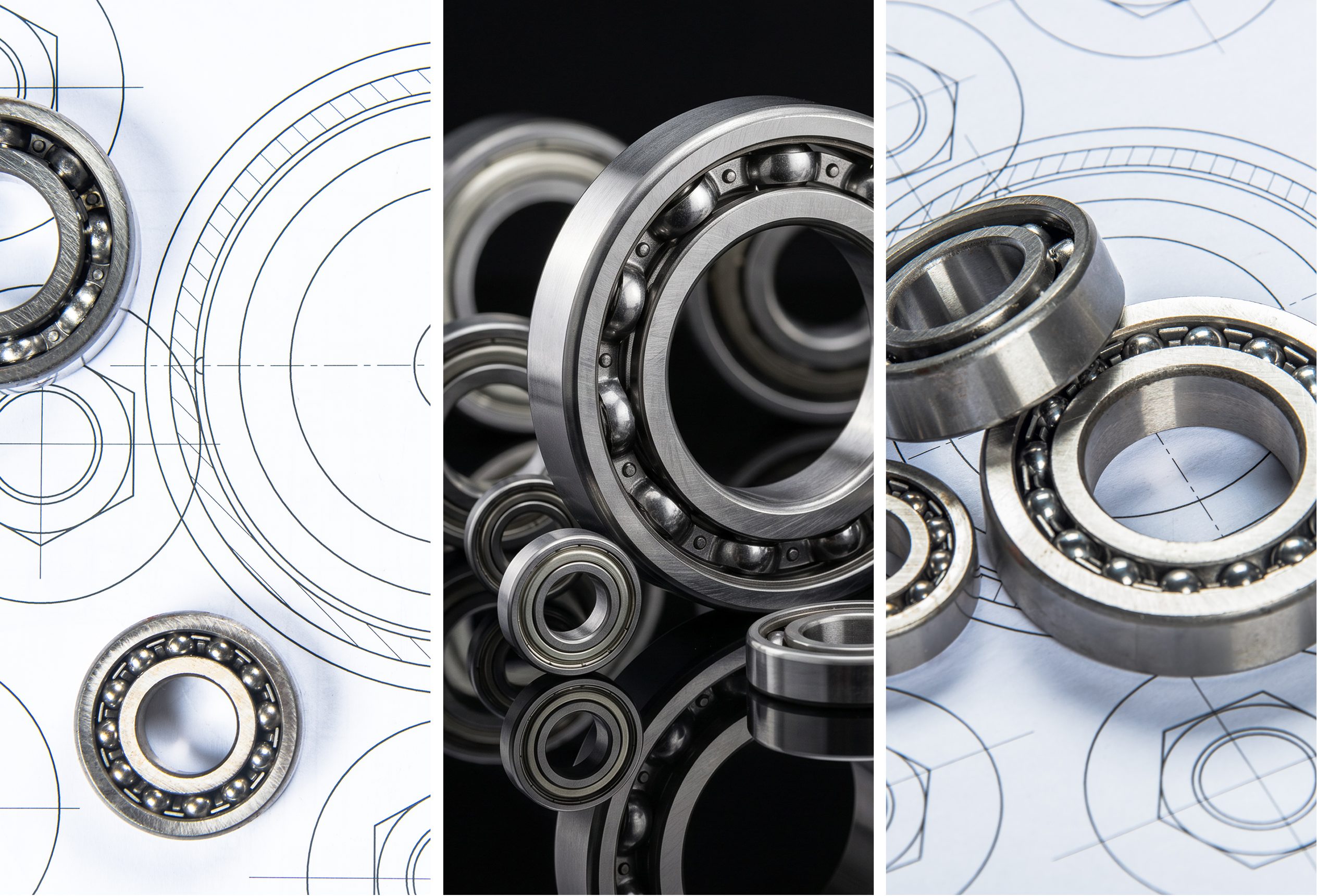
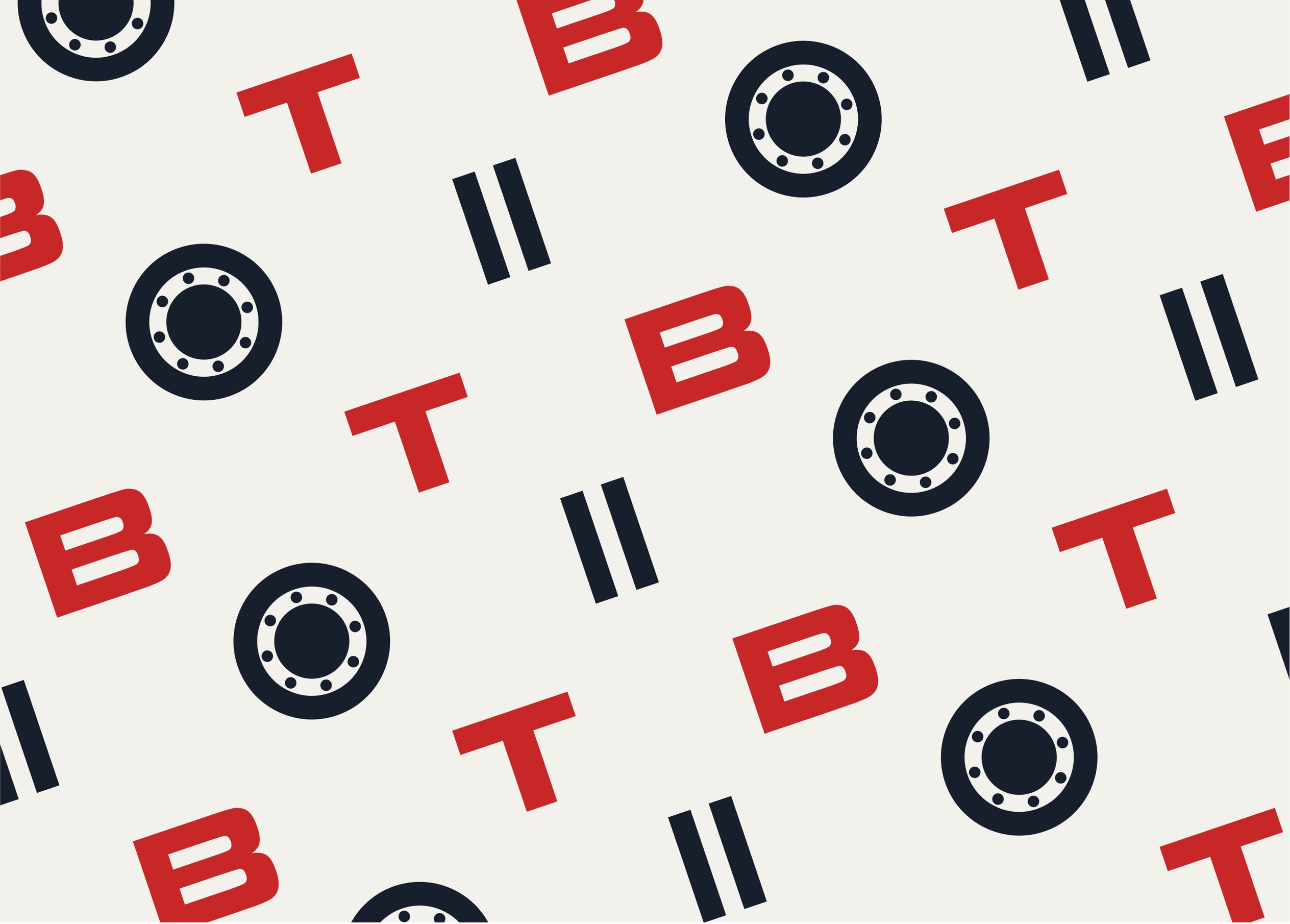
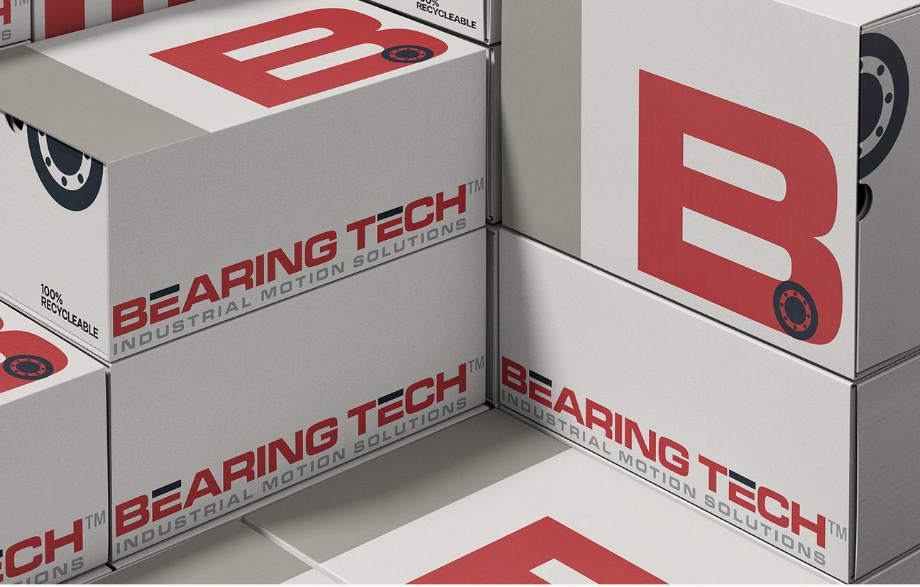
Rather than starting from a blank slate, we leaned into what Bearing Tech already had going for it: the bearing itself as a natural, literal symbol for the business, along with nearly three decades of reputation that a rebrand could sharpen rather than replace. We treated the logo as the anchor for everything else. Once the logo, wordmark, and color palette were locked in, we extended that same visual language across every piece of collateral.
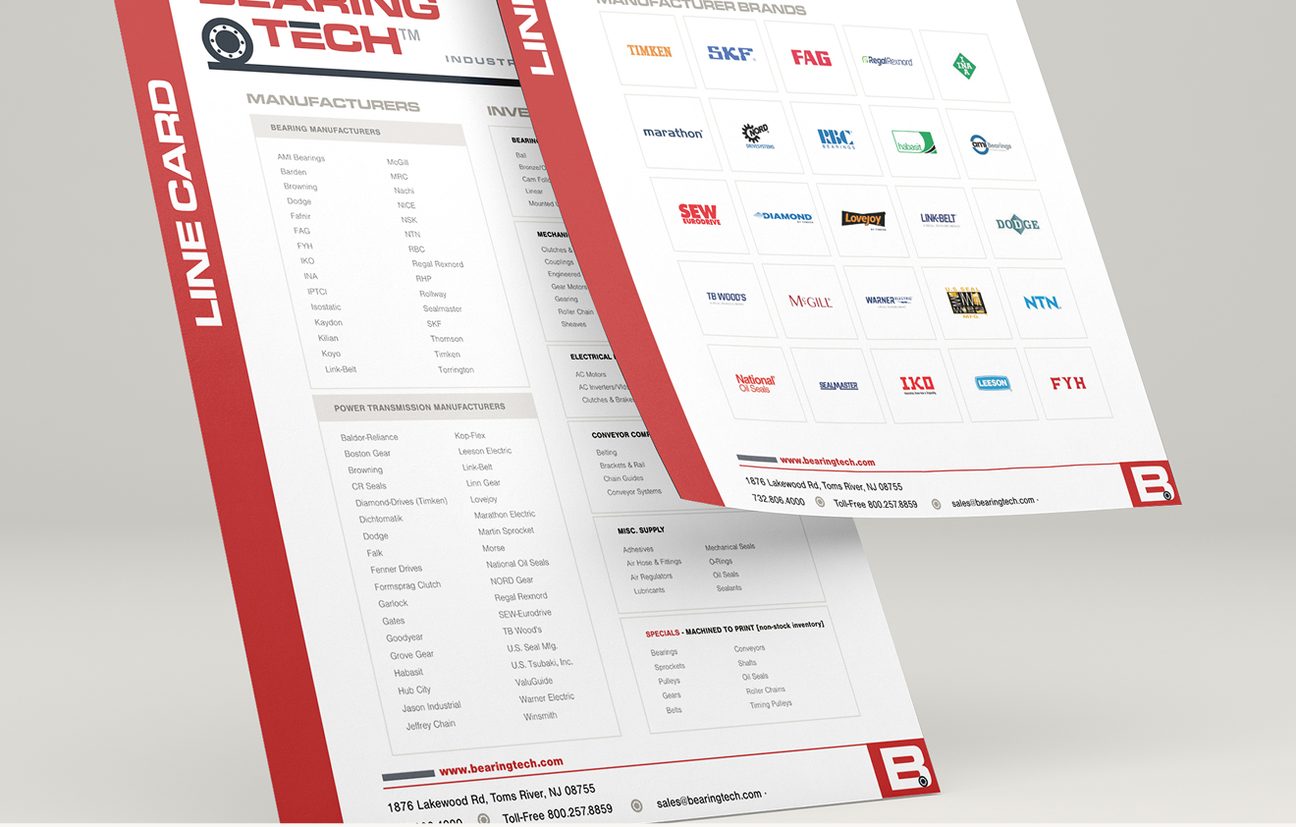
For the line card specifically, our approach was organizational as much as visual: grouping manufacturer names under clear product categories, and using hierarchy (headers, spacing, weight) to let a reader scan and find what they need, rather than searching through dense text.
What We Delivered
Updated Logo
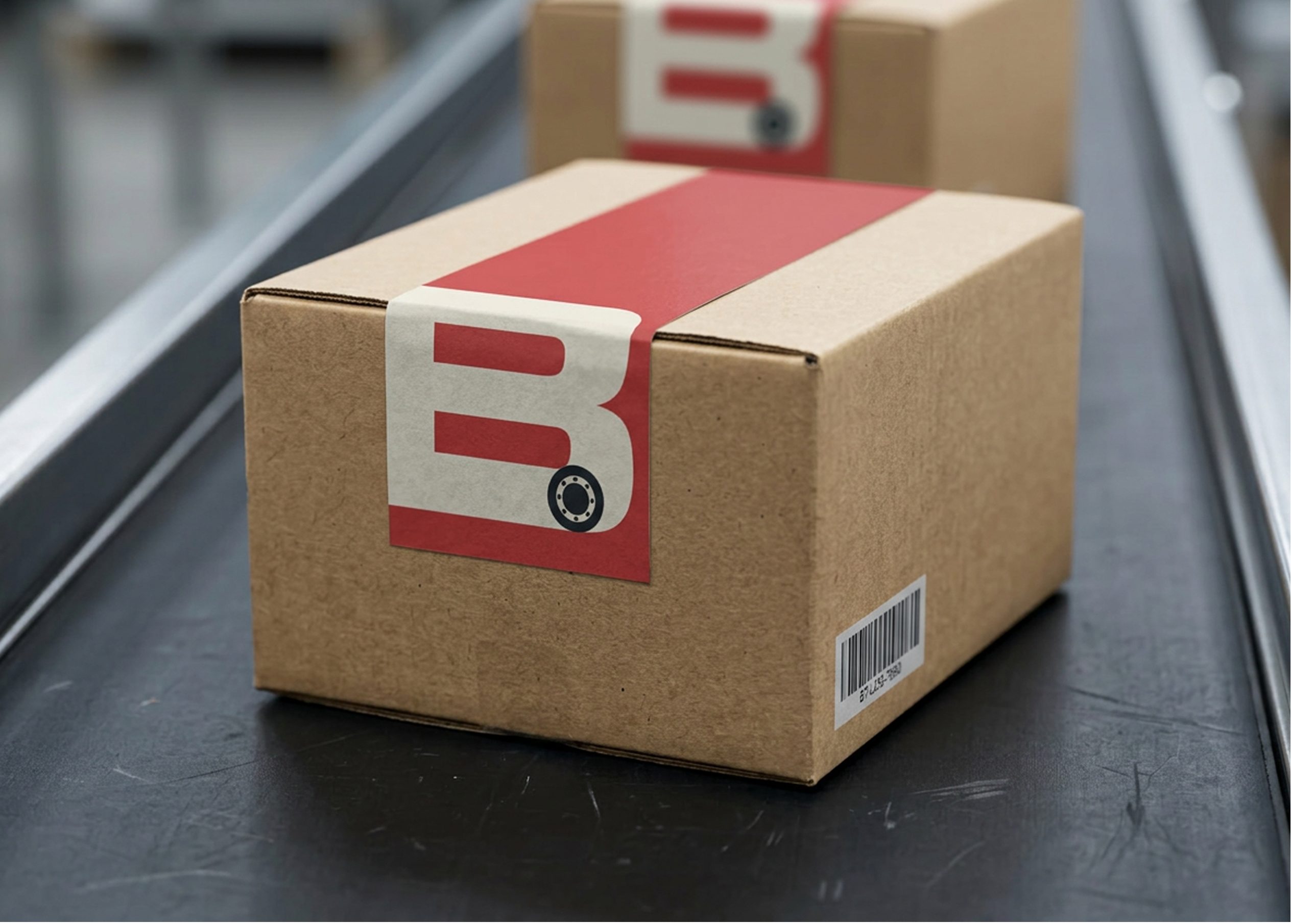
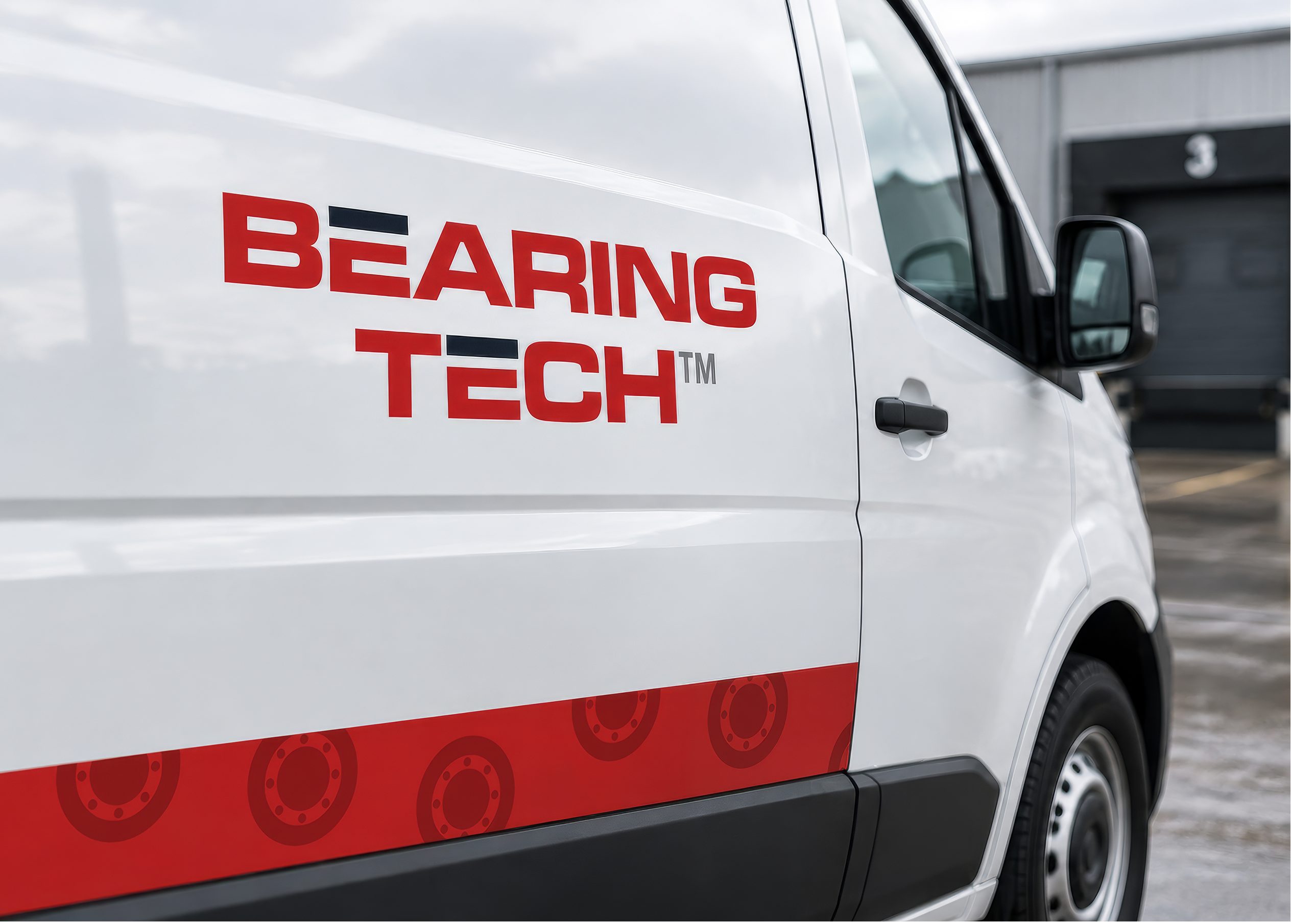
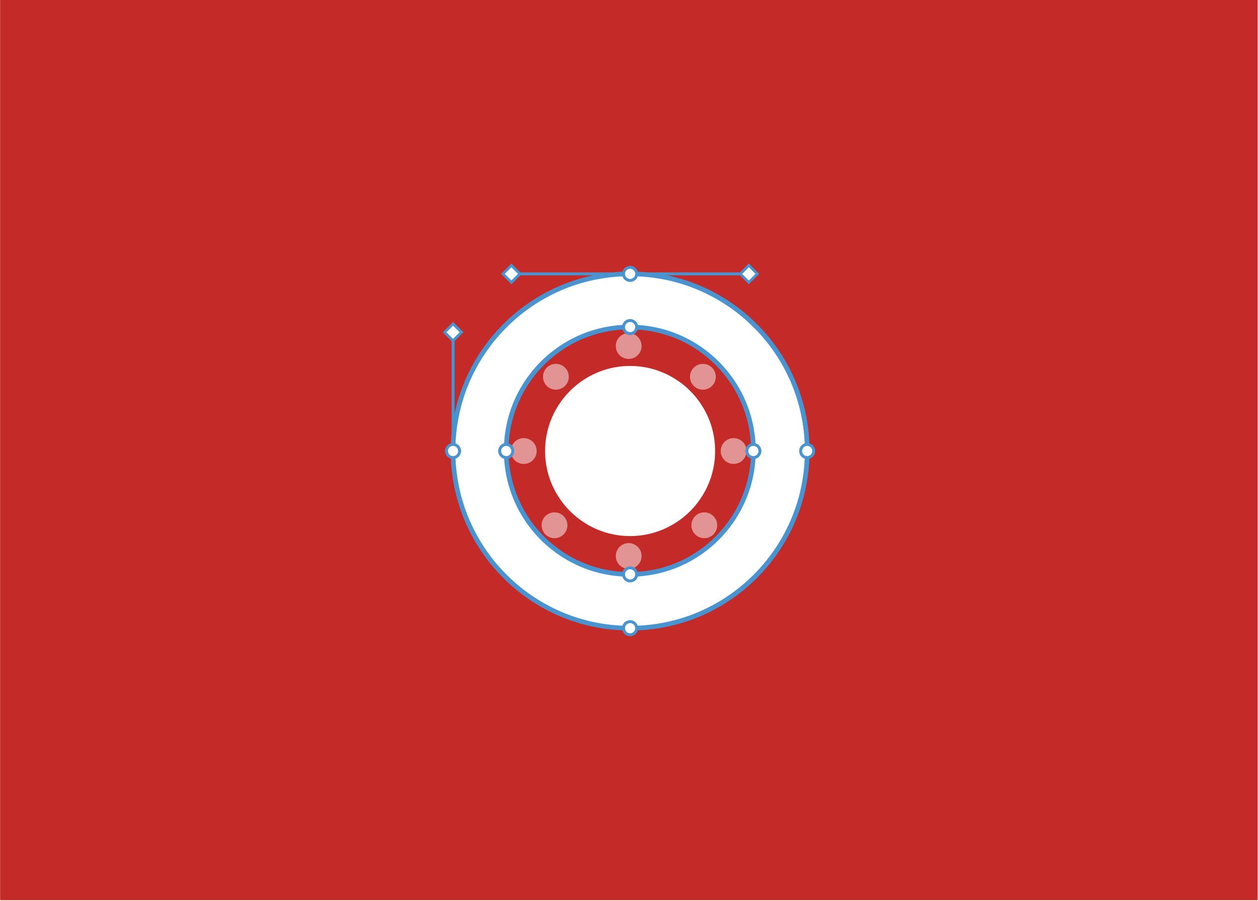
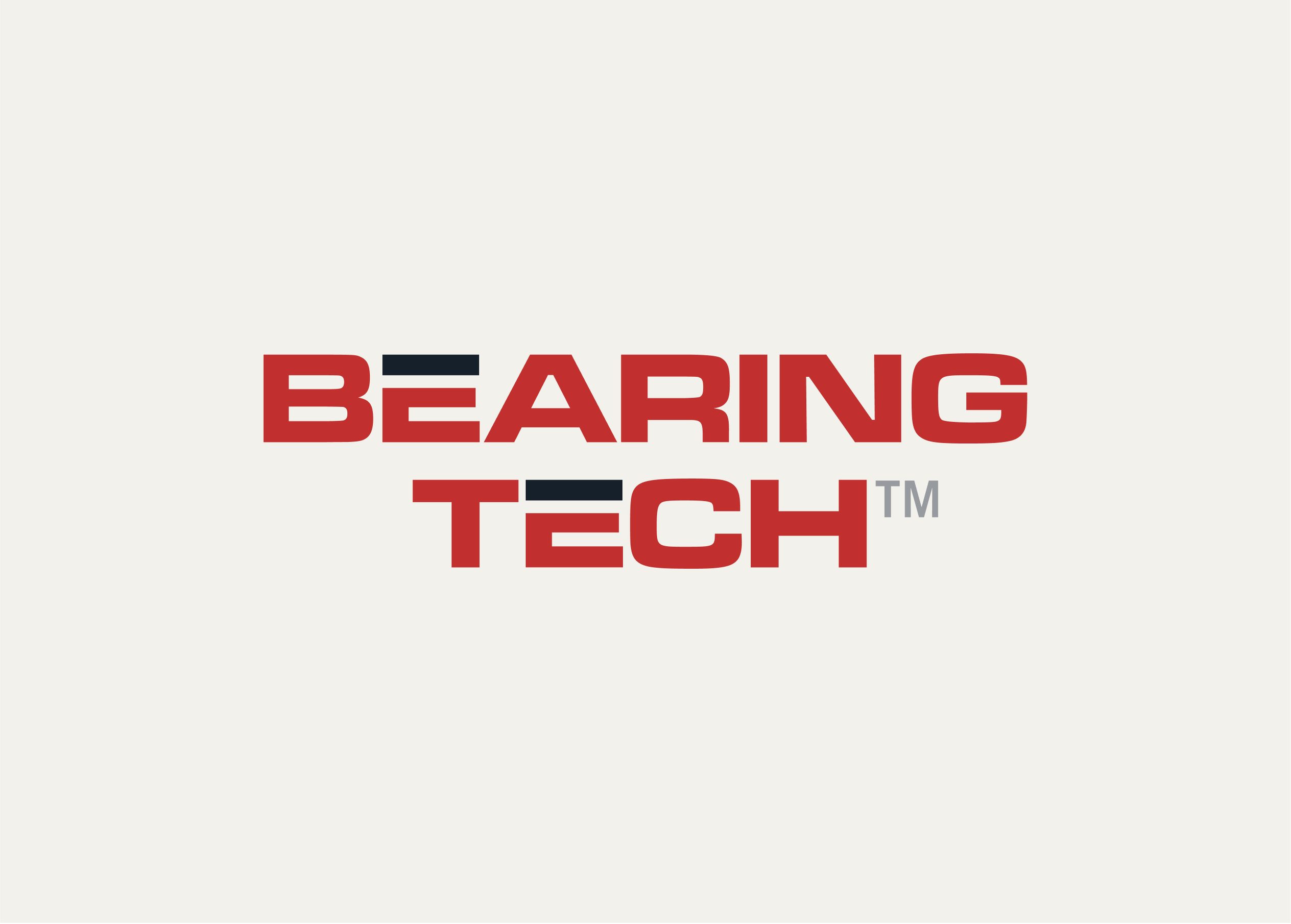
The bearing itself became the central mark. It’s the perfect metaphor for what Bearing Tech provides its customers: the parts and expertise that keep their equipment running, without any friction, whenever they need it. The clean and neat look of the icon connotes a company that is simply dependable. The straight edged design of the wordmark creates a sense of establishment and trust. At the same time, the contrast in colors and the incomplete Es add an approachable touch.
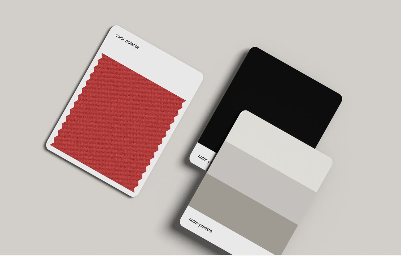
Color Palette
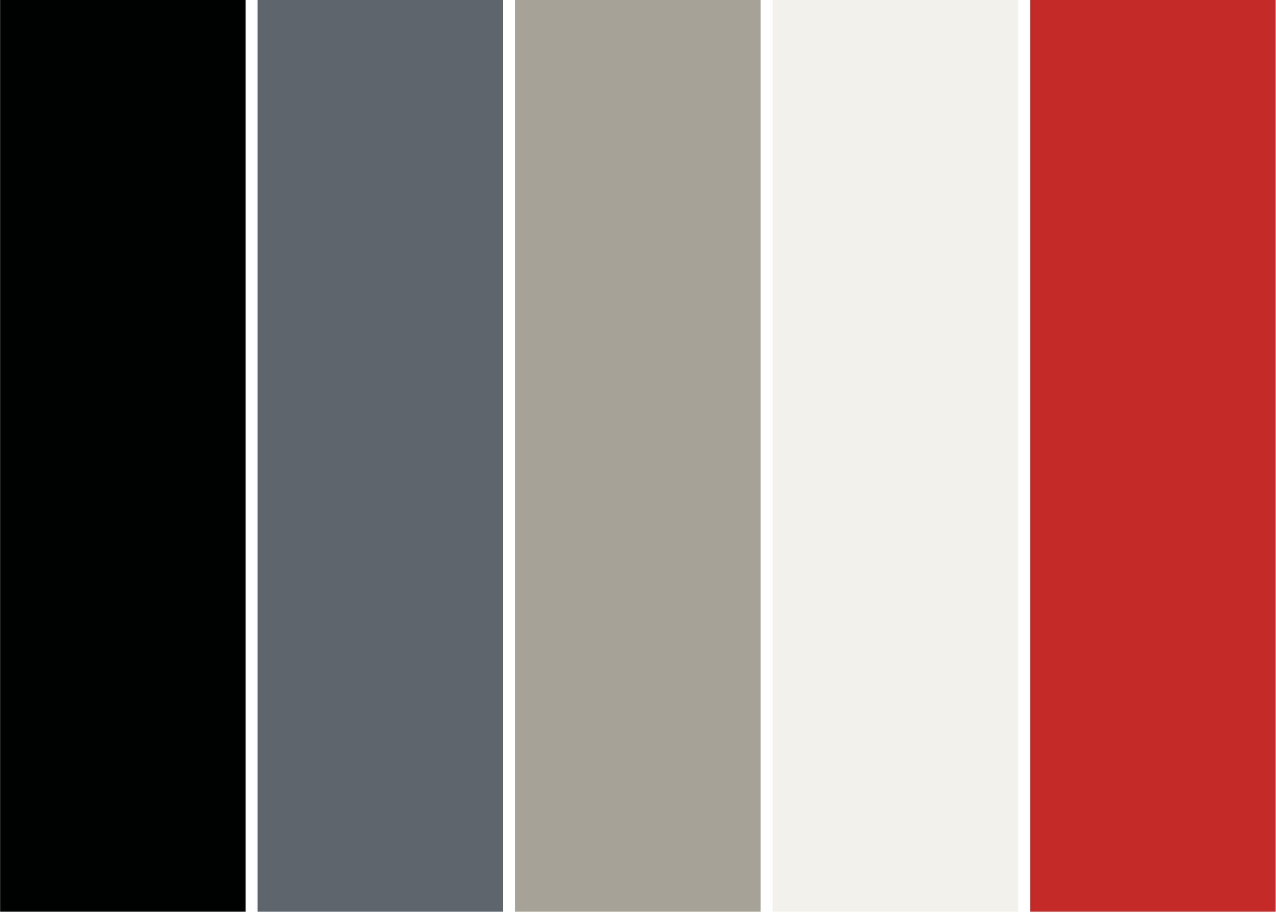
A bold, deep red anchors the identity with confidence and expertise. A softer charcoal carries supporting text and detail, keeping the overall feel assertive but human rather than corporate or cold.
Line Card
A full redesign of Bearing Tech's manufacturer and product directory. The result is a clean, easy to navigate document that sales reps can proudly hand to existing and potential customers.
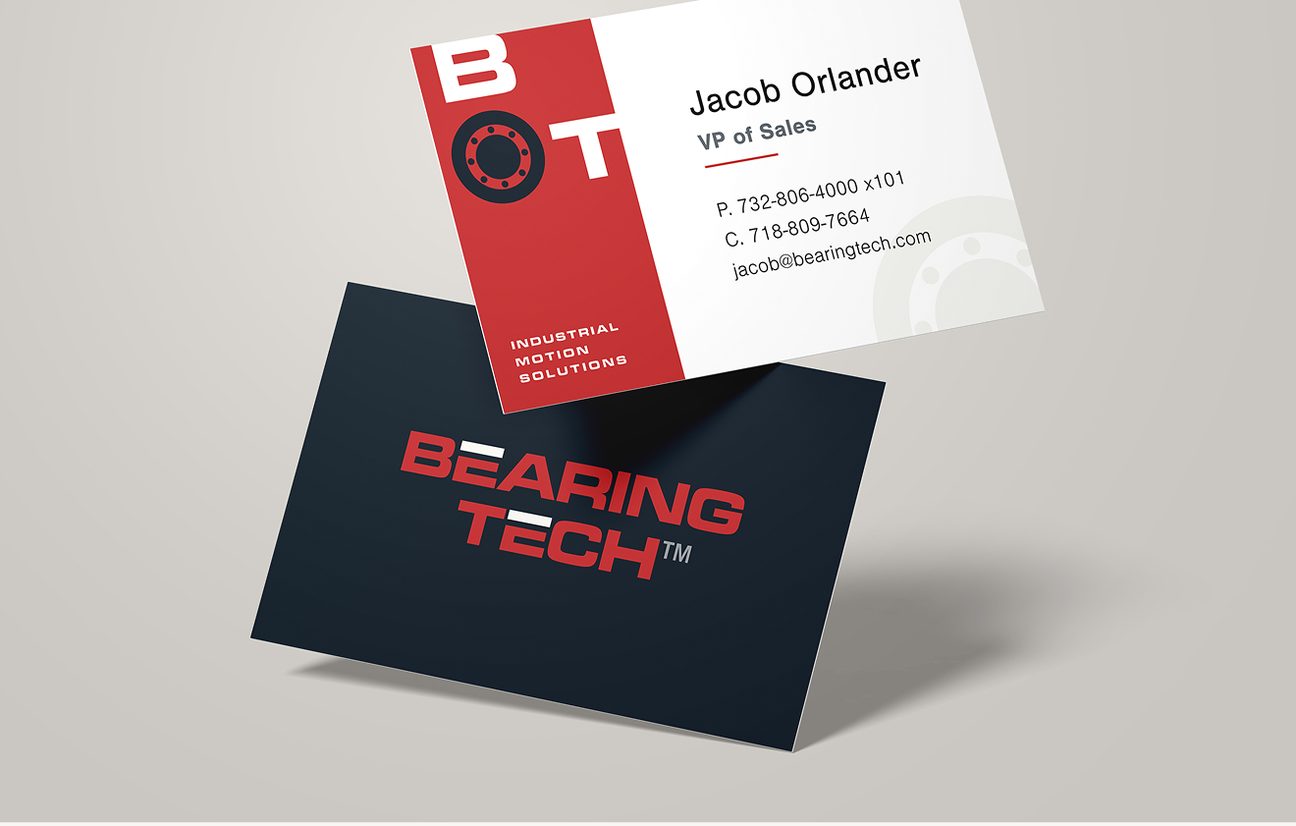
Stationery & Business Cards
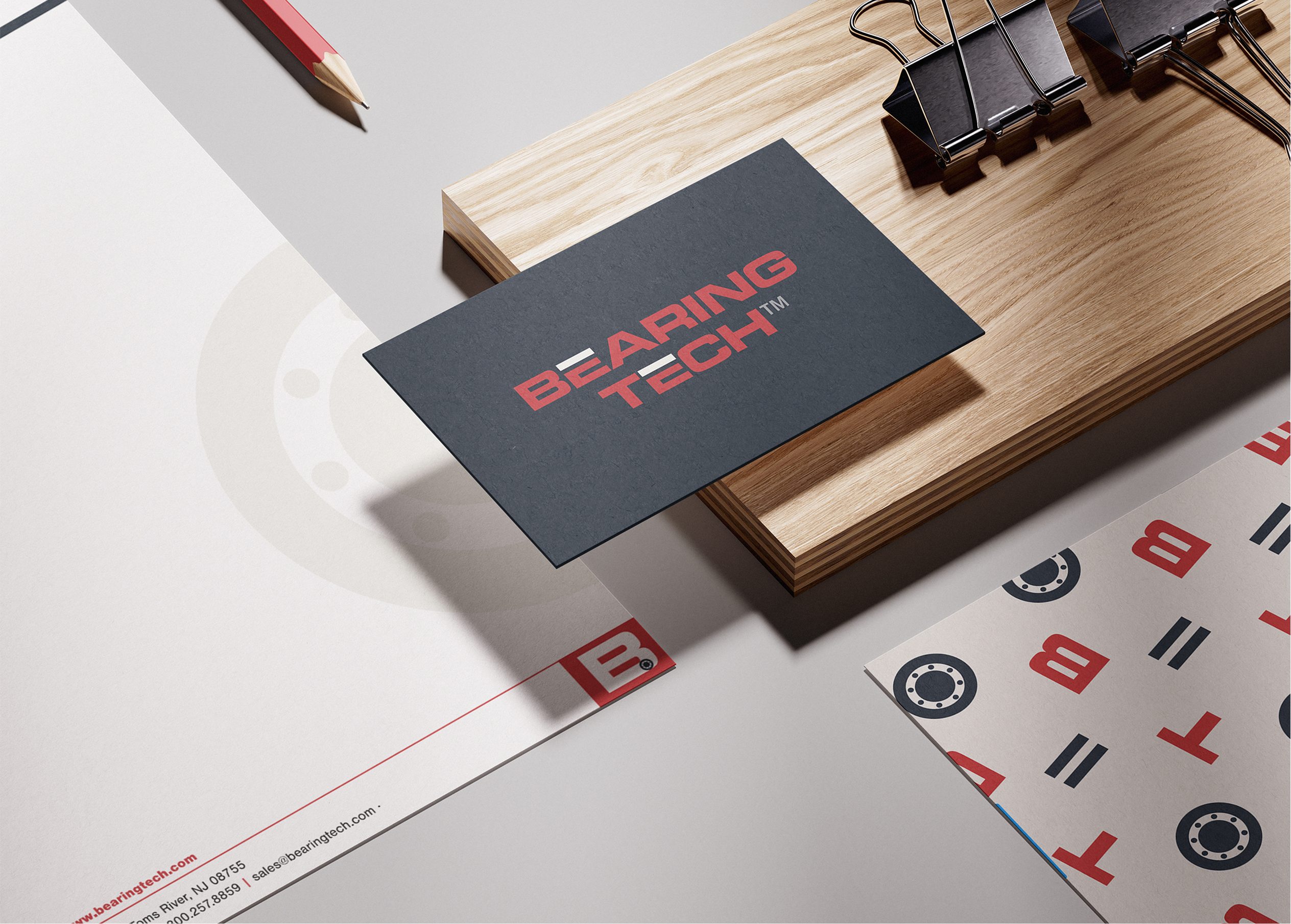
Letterhead and business cards built on the same logo, color palette, and typography, giving the team consistent print materials for everyday customer interactions.
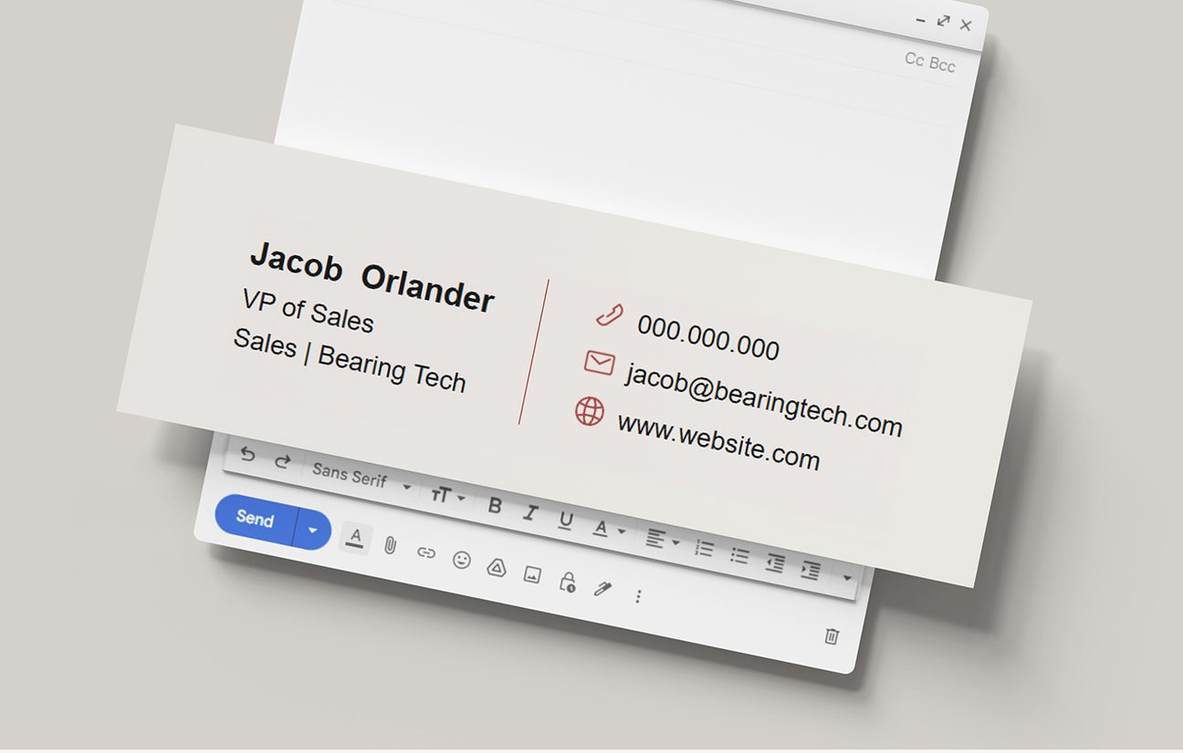
Email Signature Design
A branded email signature template, extending the same visual identity into the team's day-to-day written correspondence.
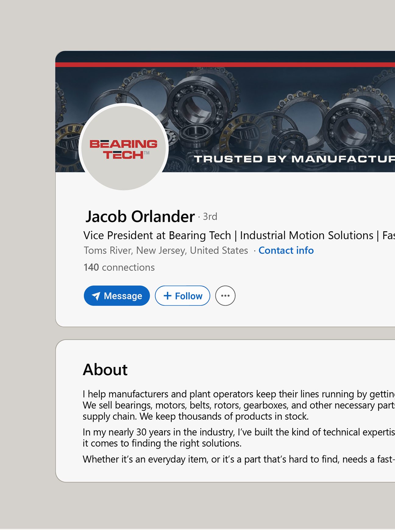
LinkedIn Banner
A custom-designed banner bringing the new brand identity to Bearing Tech's LinkedIn presence.
LinkedIn Bios
Written bios for the company's vice president and manager, giving their individual profiles a polished, relevant voice that matches the company's new brand tone.
The Result
Bearing Tech now has a brand that matches the strength of the business behind it. The redesigned logo and line card give the company a professional, cohesive face that finally reflects the depth of its catalog and the breadth of its manufacturer network.
For the first time, Bearing Tech now has a strong, clear marketing presence. The line card gives the sales team a clear, credible document to present. Consistent stationery, business cards, and professional email signature mean every touchpoint now carries the same professional impression. And with a newly designed LinkedIn banner and profile bios, Bearing Tech can extend its presence into the everyday networking of the industry.
The result isn't a change in who Bearing Tech is. It's a springboard for it to continue growing and increasing its loyal customer base.